
About the project
Company "Lina" is one of the largest producers of frozen pancakes, semi-finished products and ready-to-eat food in Russia. The most famous trademark of the company, "S Pylu S Zharu", according to the research of GFK "RUS" has the title "Pancakes №1 in Russia".
Company "Lina" is one of the largest producers of frozen pancakes, semi-finished products and ready-to-eat food in Russia. The most famous trademark of the company, "S Pylu S Zharu", according to the research of GFK "RUS" has the title "Pancakes №1 in Russia".
Task
The company "Lina" asked us to redesign the well-known and favorite by many Russians brand of pancakes "S plyu s zharu", which is widely represented in many federal networks.
The company "Lina" asked us to redesign the well-known and favorite by many Russians brand of pancakes "S plyu s zharu", which is widely represented in many federal networks.
The Getbrand team faced the task of using effective visual communications to update the appearance of the packaging, preserving continuity with the old design, and emphasizing the main meanings and values advocated by the manufacturer.
The company "Lina" is a confident leader of the cold shelf of stores of federal chains. In order to strengthen the positioning of the manufacturer's brands, it was necessary to structure the value proposition of each product. That's why our collaboration with the client began with the author's workshop "Altitude" to develop an ideal brand portfolio for the company.
Our methodology of a strategic two-day session, which brings together key employees of the company, helps to define goals, immerse in the world of consumers and develop a comprehensive strategy for brand creation and promotion.


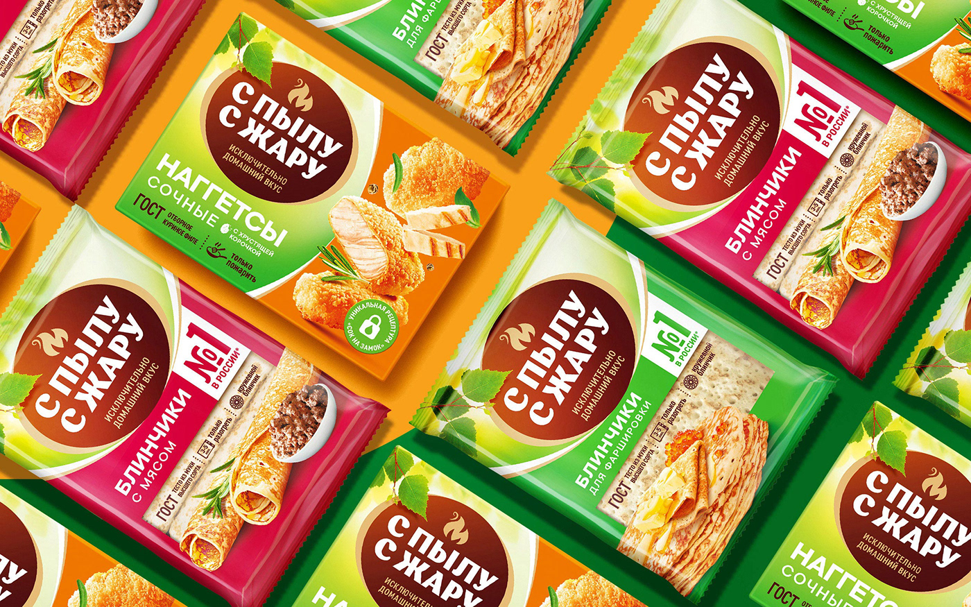
The Altitude workshop became an effective tool in building a harmonious brand portfolio for Lina. Earlier we told you about "Fiero" and "Sytyy Papa", which are sub-brands of the parent brand "S pulu s zharu".
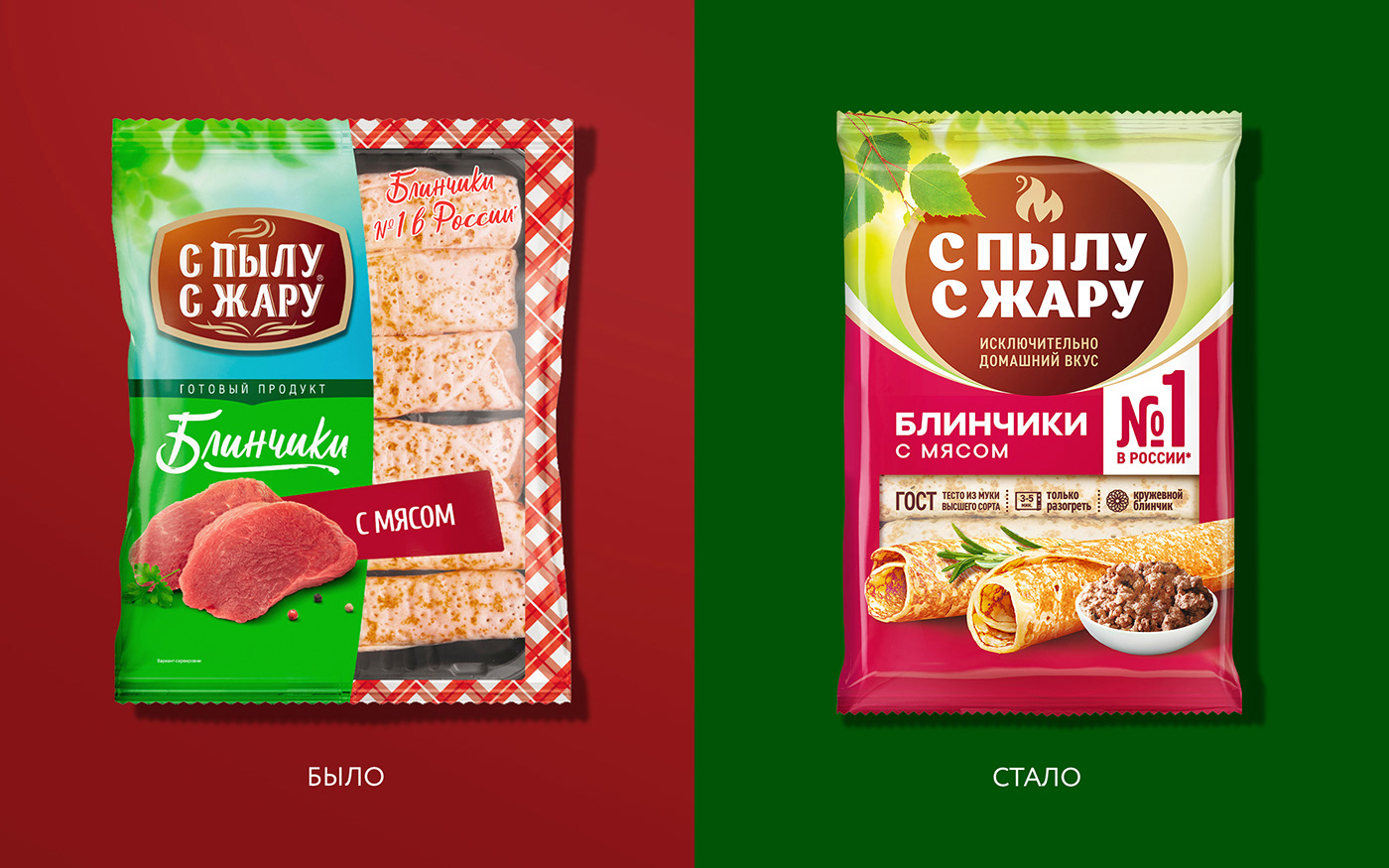
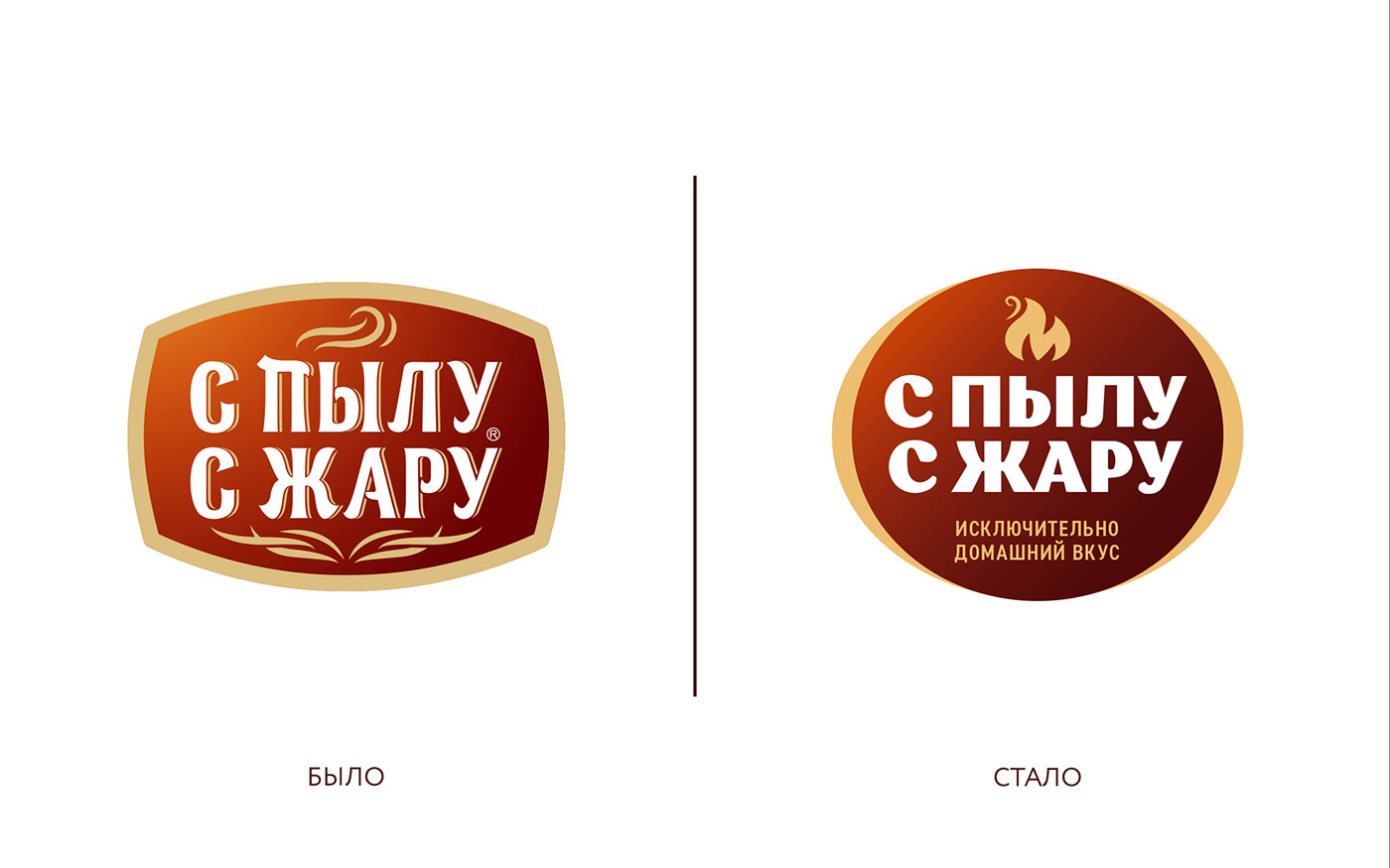
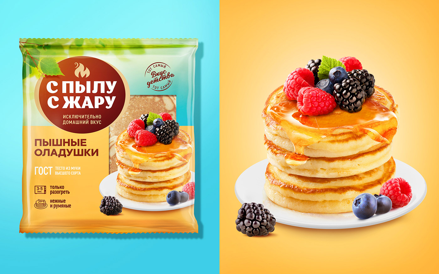
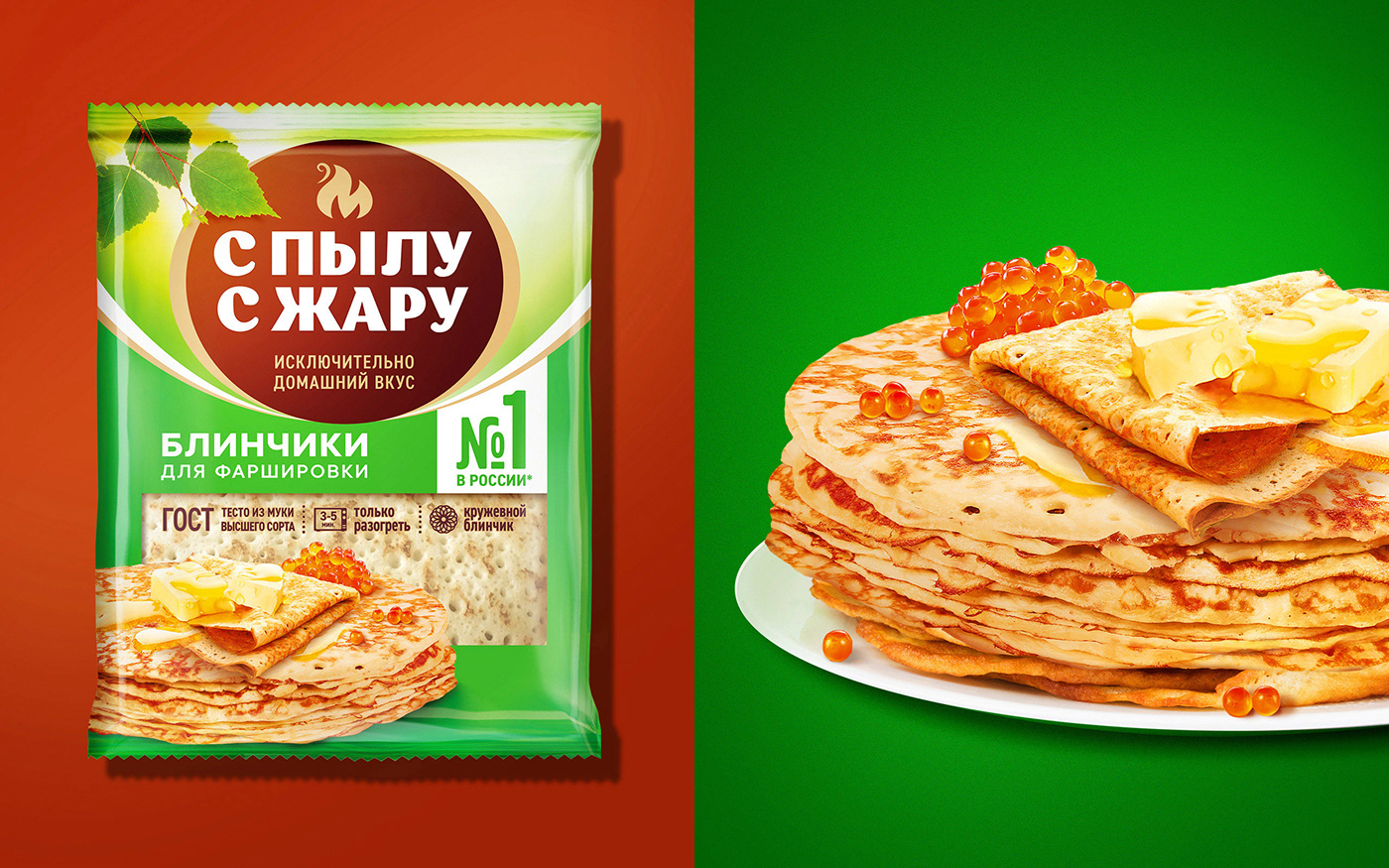
"S plyu s zharu" is a popular frozen pancake brand that holds the title of "Pancakes #1 in Russia". The previous design was in need of modernization. Before starting work on the redesign, we conducted an audit using our patented Three Layers of Effectiveness tool. The results pointed out growth points, which we took into account when developing the new design.
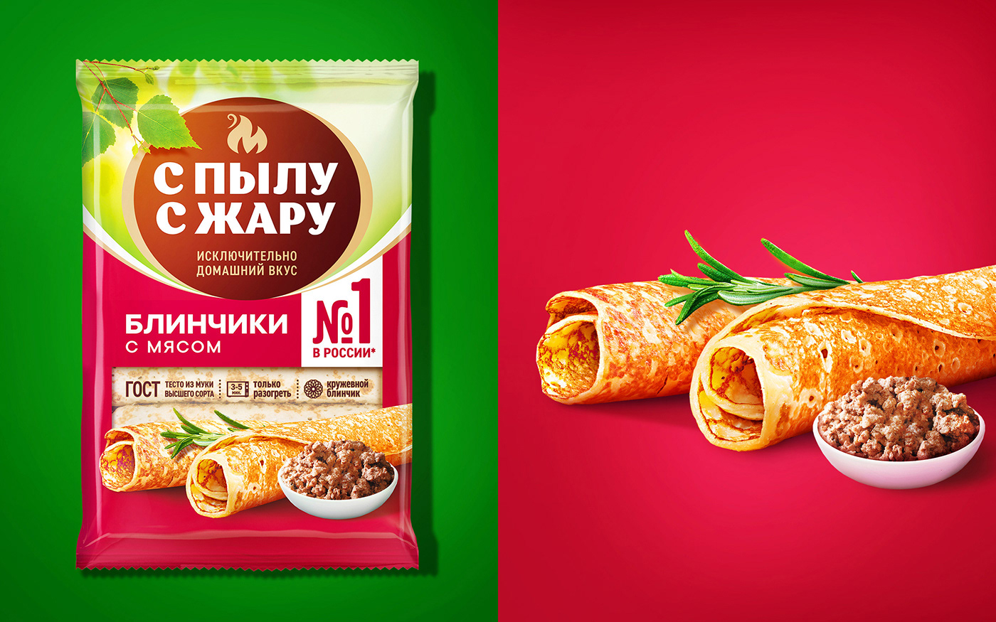
By updating the visual communication of the packaging, there was an eye-catching foodzone of ready-made delicious pancakes instead of the usual image of ingredients. The design now showcases not only the appetizing appearance of the contents, but also emphasizes the filling. In order to increase brand visibility and emphasize its positioning, the Getbrand team increased the size of the "From scratch" logo to make it really "loud" and give it a "confident" look. Such an offer simply cannot be missed on the shelf of frozen food products, which usually look boring and monotonous. The main advantages of the product are also emphasized with bright branding that has been placed in prominent places for visual comfort.
We are pleased to work with Lina, whose brands look powerful and impactful, as the best offerings among pancake products are supposed to.


